Pick your image
Compare the 8 alternatives below — each a candidate, not a step. Select one to inspect it full size.
Click image to open full size · ← → to browse 1 / 8
The run
What Image Lab planned, and what it actually cost.
launch / announcement image
3 — GPT Image 2.5 Sunburst, GPT Image 2.5 Flare, GPT Image 2
8 generated
default / 1024×1536
$0.3600 (est. ~$0.1254)
2026-09-14
The prompt
The exact brief this run used. Copy it, or adapt it.
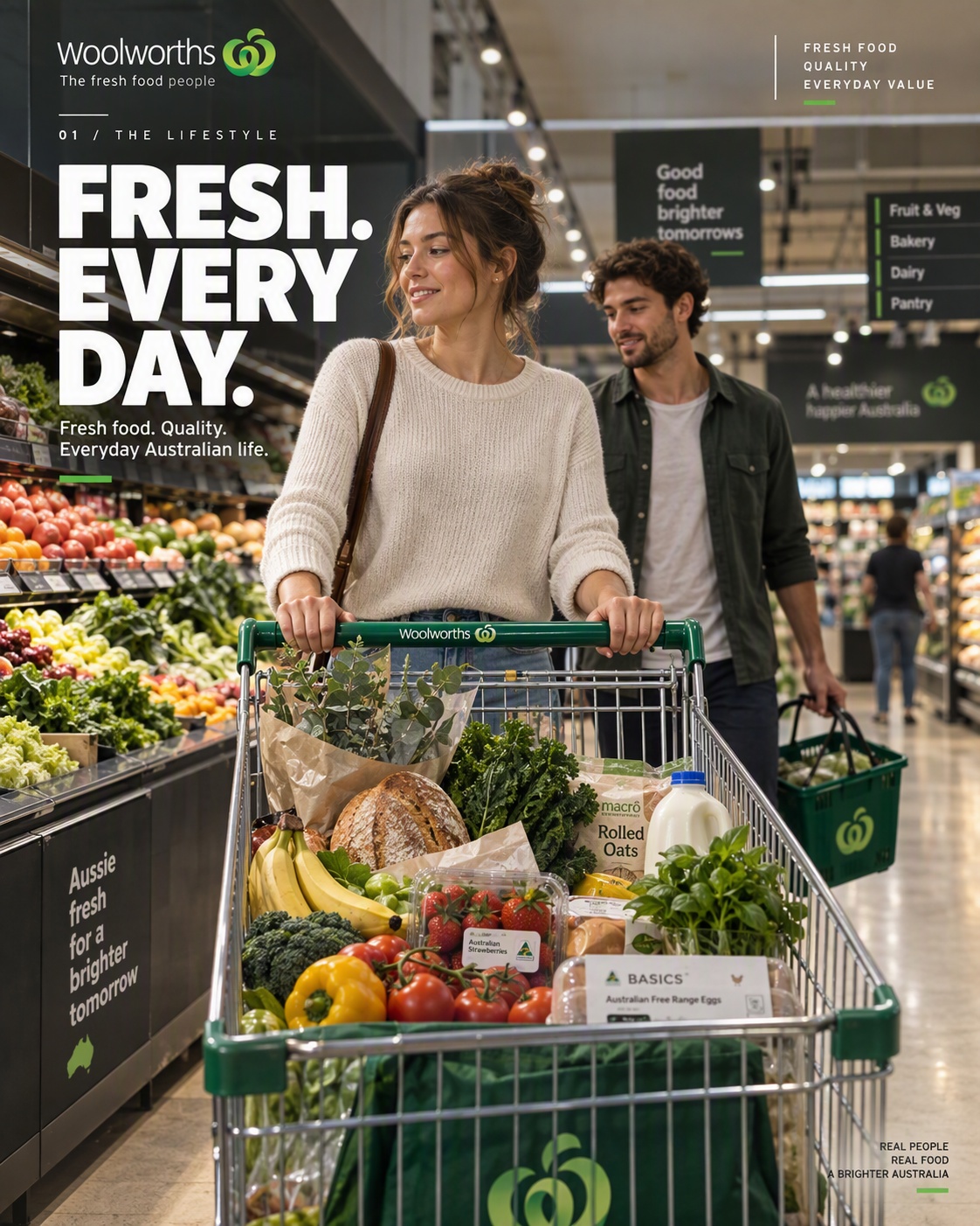
IMAGE 01 — THE LIFESTYLE Editorial Catalogue · 4:5 Vertical Everything through PHOTOGRAPHIC CHARACTER stays essentially the same as the successful Pure Hero Photography prompt. CREATIVE CONCEPT Create a premium hero photograph for a Woolworths campaign that applies the visual discipline, composition, material sophistication, and photographic quality of a world-class automotive advertising campaign to an authentic Australian supermarket shopping experience. The concept is simple: Treat the everyday Woolworths shopping trolley like a luxury automobile hero object. The result should feel like a genuinely commissioned premium advertising photograph — not a supermarket advertisement, not stock photography, and not an AI-generated fantasy environment. The supermarket remains recognizably real and Australian. The photography and art direction are elevated, not the retail environment itself. HERO STORY A stylish young Australian woman naturally pushes a classic Woolworths shopping trolley through a contemporary Woolworths supermarket. A young man walks naturally beside her, slightly behind. They are shopping rather than posing. Neither looks at the camera. Their interaction should feel spontaneous and observed — a believable moment from modern Australian everyday life. The trolley is the visual hero. It should receive the same compositional importance, physical presence and photographic attention that a premium automobile would receive in a luxury automotive campaign. The trolley contains a believable weekly shop: * fresh Australian fruit and vegetables * fresh bread or bakery products * premium pantry groceries * herbs or a small bunch of flowers * a small selection of everyday household products Every object must have believable scale, weight, material, contact and physical placement inside the trolley. ENVIRONMENT A real, contemporary Australian Woolworths supermarket. The store should feel clean, well-designed and visually considered without becoming a luxury mall or futuristic retail environment. Include: * believable supermarket aisle proportions * realistic shelving * authentic retail fixtures * strong fresh-food presence * realistic product density * contemporary ceiling architecture * subtle Woolworths-green wayfinding and signage * polished but believable flooring * natural depth extending far into the store The environment must remain recognizably Woolworths and recognizably Australian. Do not beautify the supermarket into an unrealistic luxury environment. COMPOSITION FORMAT: 4:5 vertical. Think like a premium automotive campaign photograph. Foreground The shopping trolley dominates the lower foreground. It should feel substantial, beautifully constructed and unusually important within the frame. Shoot it with enough perspective and physical presence to make the viewer instinctively treat it as the hero object. Midground The woman is the primary human subject, naturally connected to the trolley. The man is secondary and slightly behind her. Background Long retail perspective with shelves, fresh-food displays and a small number of distant shoppers. Use strong architectural and aisle lines to create depth and guide the eye toward the subjects. Composition should have clear visual hierarchy: trolley → woman → companion → retail environment CAMERA Full-frame commercial photography. Approximately 32–35mm full-frame equivalent. Low-to-medium camera height. Strong natural perspective with no fisheye distortion. The camera should feel physically present in the aisle rather than mounted at an unnatural height. Moderate depth of field: * trolley and hero subjects highly resolved * surrounding environment clearly recognizable * background gradually softer but never artificially blurred The image must retain the spatial depth of a real photograph. LIGHTING Premium architectural commercial lighting. Combine warm supermarket illumination with subtle cooler ambient light. Use controlled highlights across: * metal trolley * polished floor * glass * packaging * architectural surfaces Woolworths green should produce subtle, physically believable reflections where appropriate. Shadows should be natural and dimensional. Skin should retain realistic texture. Clothing should show believable fabric structure. Metal should have physically accurate reflections. Floor reflections should be subtle, imperfect and photographic. No artificial glow. No exaggerated cinematic effects. COLOUR Contemporary premium editorial colour grading. Natural Australian daylight-balanced colour with restrained warmth. Fresh produce should provide natural colour variation. Woolworths Green is the signature accent, appearing selectively through authentic environmental details such as signage, trolley elements and small architectural or merchandising accents. Green must be relatively rare. It should function like the signature colour of a premium automotive brand: recognizable, restrained and intentional. Do not make the entire environment green. HUMAN REALISM The people must look like real contemporary Australians photographed in an actual supermarket. Natural posture. Natural walking movement. Natural interaction with the trolley. Natural facial expressions. No influencer posing. No model-like exaggerated expressions. No direct eye contact with camera. No staged advertising smiles. Hands, fingers, arms, clothing and body proportions must be anatomically correct. The people should feel like participants in a real moment, not actors deliberately posing for an advertisement. PHOTOGRAPHIC CHARACTER The final image should feel like it was photographed by a world-class commercial photographer for a major Australian brand campaign. Reference the discipline and precision of premium automotive advertising photography, combined with contemporary Australian lifestyle editorial photography. Prioritize: * photographic realism * precise composition * authentic materials * controlled perspective * natural human behaviour * sophisticated colour * believable retail architecture * subtle visual storytelling The photograph should feel expensive because of art direction and photographic precision, not because it contains excessive luxury styling. EDITORIAL CATALOGUE DESIGN SYSTEM The photograph must now function as a premium retail catalogue cover, not simply a photograph with text placed above it. Create a sophisticated, asymmetric editorial graphic system inspired by the design discipline of premium automotive catalogues and contemporary high-end retail campaigns. The graphic system should feel designed into the photograph. It should not look like text was added afterward. DESIGN CHARACTER Think: premium automotive catalogue × contemporary Australian retail editorial × refined Swiss-inspired grid Use: strong asymmetry confident typography precise alignment generous negative space thin technical rules small catalogue identifiers restrained brand elements carefully distributed graphic anchors The design should feel expensive, confident and intentional, not decorative. PRIMARY HEADLINE Use: FRESH. EVERY DAY. The headline should be bold, confident and editorial, not thin or delicate. Prefer a stacked 2–3 line treatment, for example: FRESH. EVERY DAY. or an equivalent strong composition. Use a clean contemporary sans-serif with strong geometric or condensed characteristics. The headline should be substantially more visually assertive than the supporting text, while still occupying a relatively modest portion of the overall photograph. Prefer left alignment. Do not center the headline across the page. Do not stretch the text horizontally. Do not use oversized fashion-magazine typography. CATALOGUE IDENTIFIER Include: 01 / THE LIFESTYLE Treat this as an independent catalogue navigation element rather than simply a subtitle. It may appear near the top edge or aligned with the main typographic grid. Use small uppercase typography with generous tracking. It should be clearly visible but subordinate to the headline. SUPPORTING COPY Include one short supporting statement: Fresh food. Quality. Everyday Australian life. Place it close to the main headline as a compact editorial copy block. Use substantially smaller typography. Keep line length short. Do not create a paragraph. BRAND / VALUE BLOCK Introduce a small secondary Woolworths brand-value block in a separate area of the composition. Possible content: FRESH FOOD QUALITY EVERYDAY VALUE Keep this extremely restrained. It should function like a small information block in a premium catalogue rather than advertising copy. Position it independently from the main headline, preferably toward the upper-right or another natural negative-space area. DISTRIBUTED GRAPHIC SYSTEM Do not place all typography at the top. Use the entire 4:5 frame as a structured editorial grid. Graphic elements may appear in: upper-left upper-center upper-right lower-left lower-right depending on available negative space. Use only a few elements. Possible elements include: thin horizontal rules very thin vertical rules small corner brackets tiny catalogue numbering subtle registration-style marks small Woolworths brand symbols These elements should create visual tension and structure, not decoration. BRAND SIGNATURE Include a small, accurate Woolworths brand signature. Prefer a natural position near the upper-left or upper-right portion of the composition. The brand signature should be clearly identifiable but never dominate the headline or photograph. Woolworths Green should remain the primary brand accent. Do not introduce additional strong colours merely for graphic decoration. GRAPHIC / PHOTOGRAPH RELATIONSHIP Typography should interact with the architecture and negative space of the photograph. Where possible: align text with architectural lines use shelf or ceiling geometry as compositional guides allow graphic rules to echo perspective lines place text in naturally quieter areas never cover important facial features never obscure the trolley never obscure important products The graphic system should feel as though the photographer and graphic designer designed the composition together before the photograph was made. TYPOGRAPHIC HIERARCHY The hierarchy should be: 1. Hero photograph 2. Trolley + human story 3. Primary headline 4. Woolworths brand 5. Catalogue identifier 6. Supporting/value information 7. Technical graphic details The photograph must remain dominant. The typography should make the photograph feel more like a campaign, not compete with it. IMPORTANT — DESIGN DIRECTION The result should feel closer to a real premium retail catalogue cover than to a conventional supermarket advertisement. Avoid: centered headline thin luxury-magazine typography large empty banner at the top text confined entirely to the top edge generic corporate presentation excessive copy poster-like advertising fashion-magazine clichés Instead use: bold editorial typography + asymmetric composition + restrained information blocks + distributed graphic anchors. FINAL DESIGN TEST At thumbnail size, the image should still immediately read as: a premium Woolworths campaign photograph. At larger size, the viewer should discover: the catalogue system → headline → brand → information details. The graphic design must reward closer inspection without overwhelming the photograph. ABSOLUTELY AVOID Avoid generic stock-photo supermarket scenes, staged advertising poses, people looking at camera, exaggerated smiles, perfectly symmetrical aisles, unrealistic supermarket architecture, luxury-mall aesthetics, futuristic retail design, excessive green, excessive bokeh, fisheye distortion, extreme wide-angle distortion, artificial glow, excessive lens flare, fake HDR, oversaturation, plastic skin, CGI-looking materials, impossible trolley geometry, floating objects, duplicated products, duplicated people, distorted hands, malformed bodies, warped shelving, nonsensical packaging, fake or distorted branding, and visible generative artifacts. Do not make the image look like an AI concept render. Do not turn the supermarket into a futuristic or luxury environment. Do not make the trolley physically impossible. FINAL OUTPUT 4:5 vertical. Photorealistic premium commercial photography combined with a sophisticated asymmetric editorial catalogue system. One coherent photographic world, one hero story, one hero trolley, one unmistakably Woolworths identity, and a confident but restrained graphic language.
→ use Image Lab
- Copy the prompt above.
- Paste it into any agent that has the Image Lab skill — or install it below.
- Run it as-is, or swap the subject, style, or details to make it yours.
How this was made
Image Lab is not a benchmark — different models and seeds make these an unfair comparison. It turns one brief into strong choices. Everything below did real, billed work in this run.
- CogFoundry model gatewayRan every generation in this run through
POST /api/v1/tasks/generationsand reported the real per-image cost. Run total: $0.3600. - GPT Image 2.5 Sunburst3 alternatives (A, B, C).
- GPT Image 2.5 Flare3 alternatives (D, E, F).
- GPT Image 22 alternatives (G, H).
- Image LabA loomloom community example — the skill that classified the brief, chose the model allocation, gated the cost, and rendered this page.
From image exploration to AI work.
loomloom will bring agentic workflows to Image Lab — turning a single prompt into an iterative process of generation, evaluation, selection, and refinement.
Bring your own prompt
Install Image Lab, give it any image prompt, and run cost-gated exploration across the best-fit models.
npx skills add cogfoundry-labs/loomloom --skill image-lab -a claude-code -g -y