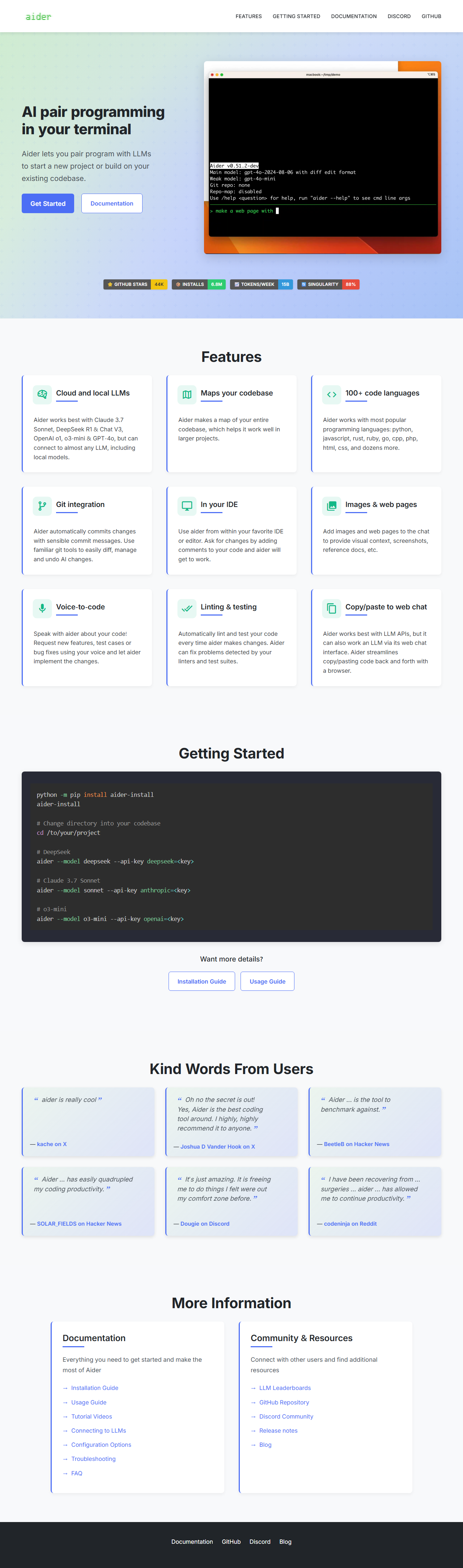
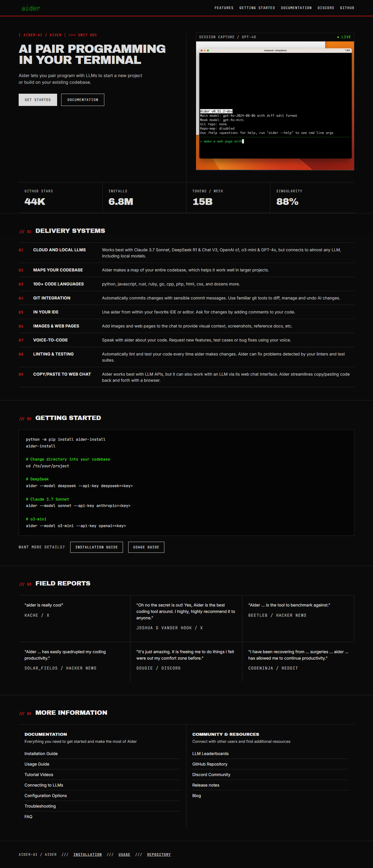
Drag the handle to compare the top of each real page.
BeforeAfter: validated redesign preview (live pages, top of page only -- see the full page below for the rest)
Share this chapter
A full-page comparison (static screenshots, not the live sites above) -- drag the handle, then scroll down inside it to see the rest of both pages together.
The headline typography transitioned from Inter's extra-bold weight and standard casing to a more assertive display using Archivo Black. This change incorporated a heavier black weight and uppercase transformation, paired with tighter letter spacing and a reduced line height, to establish a more distinct visual hierarchy.
Share this chapter
/// 02
Nav Typography
Before
Nav link style: {'fontFamily': 'GlassTTYVT220, monospace', 'fontWeight': '600', 'fontSize': '28.8px', 'letterSpacing': '0.5px', 'textTransform': 'none'}
After
Nav link style: {'fontFamily': '"JetBrains Mono", Consolas, monospace', 'fontWeight': '400', 'fontSize': '12px', 'letterSpacing': '0.96px', 'textTransform': 'uppercase'}
The navigation typography transitioned from a 28.8px, semi-bold `GlassTTYVT220` typeface to a 12px, regular `JetBrains Mono`. This modification reduced font weight and size, while simultaneously increasing letter spacing and applying an uppercase text transformation. These adjustments refined the visual presentation of navigational elements, establishing a cleaner, more contemporary aesthetic.
The color system was refined from a general-purpose palette to a highly focused, high-contrast set of tokens. This revision established a dark background with a bright foreground, introducing distinct semantic colors for elements such as lines, dim states, and critical alerts, alongside a prominent phosphor green.
Share this chapter
/// 04
Structural Framing
Before
Header border: False, section labels: 0
After
Header border: True, section labels: 0
The visual presentation of Structural Framing underwent a precise modification. Originally lacking a distinct header border, the section now incorporates one to enhance content delineation, while the absence of numerical section labels remains consistent.
Share this chapter
/// 05
Corner Treatment
Before
Rounded corners present: True
After
Rounded corners present: False
Initially, the design incorporated rounded corners, which contributed to a softer visual profile for various elements. The subsequent update transitioned to sharp, angular corners, establishing a more defined and contemporary aesthetic across the application.
Initially, the layout density was established using a grid with track counts of [2, 3]. The design evolved to incorporate a third grid track, resulting in new counts of [2, 4, 3]. This modification increased the number of structural units, allowing for greater control over content distribution.
Share this chapter
How loomloom Did It
The Workflow
The Request
“Redesign https://aider.chat/”
Discover
Understand the existing site: real structure, real assets, real constraints, no model call.
Analyze
Measure the real design system and audit it against a declared design authority's own rules.
Explore
Build real, working direction slices and structural variants: real code, never a mockup.
Select
A human picks the direction and variant that actually fits, from real rendered pages.
Implement
Turn the chosen direction into the real page: real copy, real assets, real responsive layout.
Validate
Real mechanical checks and a real axe-core accessibility scan; any failure blocks completion.
loomloom's role in this case study: writing the 6 narrative paragraphs above from real, verified facts, the only real model call in this run's Share stage. No image was generated: the hero above uses the real color tokens from the actual redesign directly, not an AI illustration of them.
Validation
It Works, Not Just Looks Right
11/11Mechanical checks passed
0Accessibility violations (real axe-core scan)
✓Responsive layout (mobile / tablet / desktop)
✓Real rendered implementation, not a mockup
Reproduce This
How This Was Actually Built
This redesign is built on real open-source work. Thanks to every project below: each is listed because real evidence of its use exists in this run.
redesign-labThe end-to-end pipeline (Discover, Analyze, Explore, Select, Implement, Validate, Share) that produced this entire redesign and case study.
senlindesign/taste-skillMeasured the original page's real design system (colors, type, spacing, layout) via screenshot and DOM extraction -- the raw input to Analyze.
leonxlnx-taste-skillSupplied the build rules, direction-variant families, and the mechanical Pre-Flight Check this redesign was built and validated against.
anthropics/skills (webapp-testing)Rendered and screenshotted every real direction, variant, and the final implementation for functional and responsive checking.
snapsynapse/skill-a11y-auditRan the real axe-core accessibility scan that found (and confirmed the fixes for) this run's Validate-stage violations.
cogfoundry-labs/loomloomGenerated the 6 narrative paragraphs in the Design Transformations section above from this run's real, verified facts. Total cost: $0.0089.
The before target(s) were fetched live at 2026-08-24T01:55:47.862749+00:00 (Share time), not re-read from a saved snapshot of what Gate 2 actually showed. If a live external site changed since that approval, these facts may not exactly match what the human saw and chose.